🥷 [S2] Challenge 08
Just KNIME It, Season 2 / Challenge 08 reference
Challenge 08 Description
The Eurovision Song Contest (ESC) is a song competition with participants mostly from european countries. In the contest finale, each country gives points to the others, and the sum of the received points determines the winning country. In this challenge, you will experiment with the Network Mining nodes in order to visualize (in a Network Viewer) the points given and received by each country. Note: The contest regulation changed over time, and it might make no sense to aggregate points from different editions.
Points worth mentioning
- The number of countries participating in voting remained stable between 1975 and 2012.
- Clustering countries based on voting patterns reveals similarities in cultural backgrounds and interests.
- Network visualizations face challenges in observing a large number of nodes and lack directed graph options.
- Germany and Greece exhibit similar voting patterns and Greece consistently awards high scores to Cyprus. Do you know why? 😁
Network Mining Process
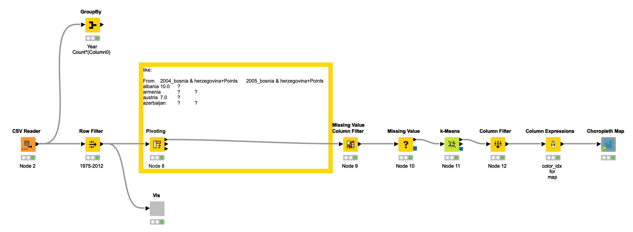
Initially, I analyzed the number of countries that participated in voting each year and noticed some variations. However, I observed relative stability in the quantity of participating countries between 1975 and 2012. Therefore, I selected this timeframe as a subset of the overall data to further investigate.
Before visualizing network mining results, I would like to investigate the voting patterns of different countries. Are there any discernible similarities? I began by performing a pivoting operation and then removed columns with numerous missing values. I utilized the K-means method for clustering, which revealed that countries with similar voting patterns were often located in close geographic proximity. This suggests that they may share similar cultural backgrounds and interests.
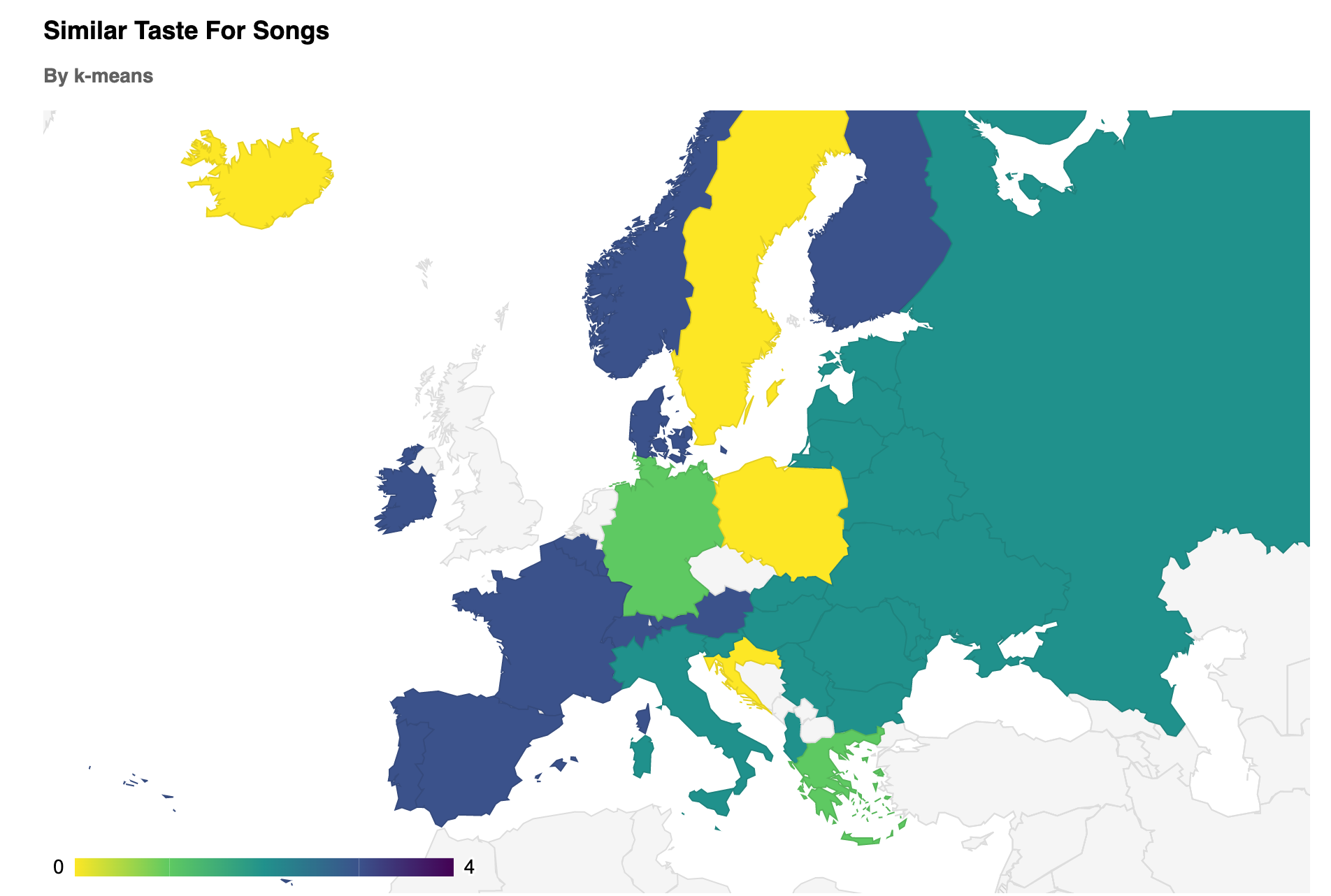
There are a few things that interest me about Germany and Greece, despite their geographical distance, they share some common interests. Now, let's move on to the network visualization node.
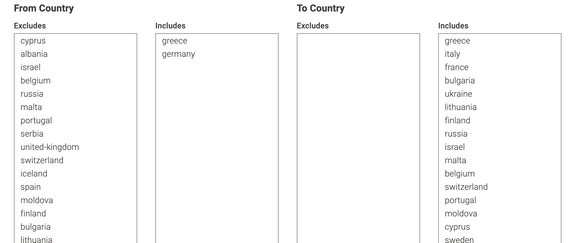
When visualizing data from 1975 to 2012, I find it difficult to observe when there are too many nodes. To address this issue, I use two row filter nodes to filter out the countries I want to prioritize for observation. I also control the score range for further analysis.
I haven't had the chance to fully explore all the network view options yet, but upon initial observation, it appears that some options may be missing, particularly for directed graphs. In regards to the specific question at hand, with two country select options for "from" and "to", I was unable to find an option to clearly mark the color of the arrow.
Under certain layouts, I've noticed that the pictures appear quite unattractive. It's possible that implementing more advanced graph algorithms for this node might enhance the display of this view. However, for our present scenario, this is not a crucial factor. Our aim at the moment is to focus and observe.
Let's revisit the earlier question about Germany and Greece's voting patterns. By manually adjusting the nodes, we can see that Germany and Greece consistently share similar tastes in music, as shown below. Germany is at the top, and Greece is at the bottom.
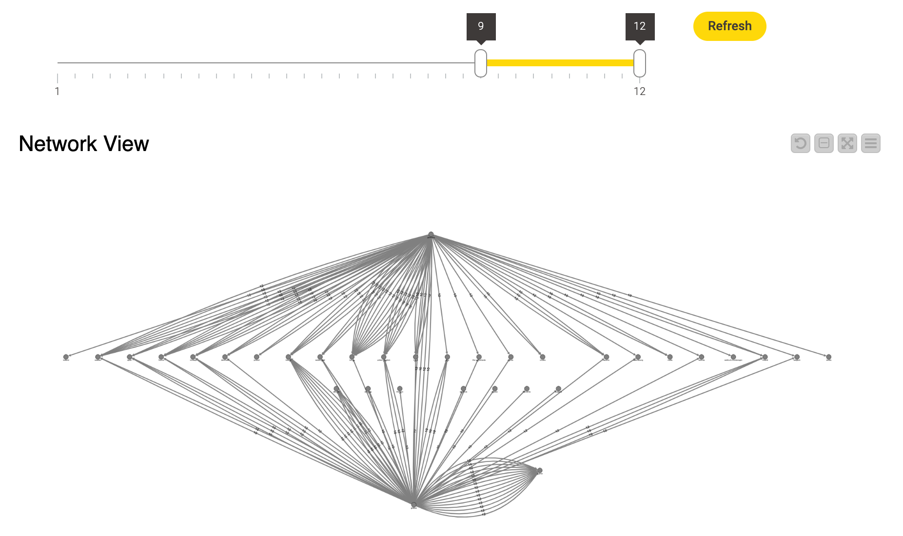
Aside from their similar voting patterns, there is one particularly intriguing point that caught my attention: to the right of the node representing Greece is another node that consistently receives high scores from Greece, without any hesitation. Can you guess which country it is?
Cyprus.
Greece and Cyprus share a strong cultural and political bond, stemming from their shared history and language. While Cyprus was once a British colony until it gained independence in 1960, it has maintained close ties to Greece. As a fellow member of the European Union, Greece has been a consistent ally to Cyprus during the ongoing conflict with Turkey over the island's division. The two countries have cooperated on various fronts, including economic development, trade, and security. This relationship is characterized by a mutual willingness to support each other and work towards common goals.
Another thoughts
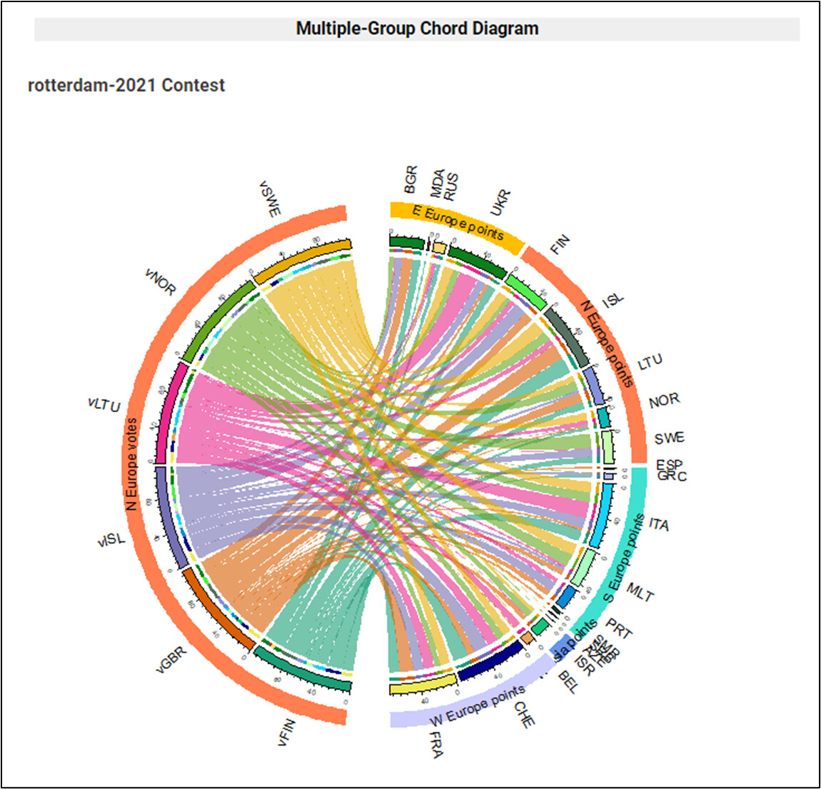
- Someone in the forum used Chord Diagrams to display information, and they looked beautiful. I believe that Chord Diagrams are a type of networking visualization that is less frustrating, particularly because of their interactivity, which is very useful.
- I guess that the Chord Diagrams don't offer much control over color options, or perhaps it's simply difficult to make adjustments. Just a guess.
- I'm completely stumped on how voting patterns evolve over time.