🥷 [S2] Challenge 15
Just KNIME It, Season 2 / Challenge 15 reference
Challenge question
Create a Dashboard to Update Actuarial Information
Level: Medium
Description: You are a freelance data scientist and are asked to help an actuarial agency. To compute premiums for life insurances, actuaries need to find the age-dependent information about customers from an Actuarial Life table containing the probability of dying within 1 year and life expectancy. Your task is to make this process faster: create a dashboard in which an actuary specifies the age of the customer and this action updates probabilities and life expectancy for both genders. Feel free to use either tables or graphical representations of data. Hint: To combine values of the first 3 rows to use as column headers, refer to this workflow from the Community Hub. Hint 2: The Integer Widget does not refresh the interactive view of the component. Consider adding the Refresh Button Widget.
Workflow
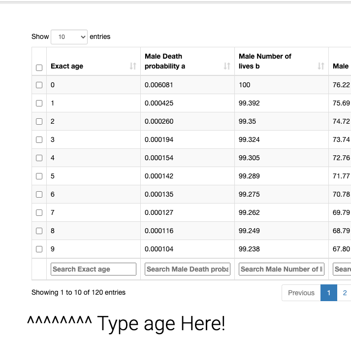
The task is to merge the first three rows of an Excel spreadsheet into a common header and then create an age-based query interface. While this may sound simple, creating a visually appealing dashboard requires time and careful consideration. In this example, I am using the table view's search function and providing a basic hint. I think it's okay for a basic function like this in less than 10 minutes.

Any thoughts?
- Furthermore, there is some valuable knowledge that can be gained from the community's response. For instance, the workflow mentioned below includes a well-designed table (with a styled header) and mark the specific data points in the graph, which is a best practice. This approach makes it easier to identify any errors in the data.

- For complex user interfaces, it is crucial to provide users with helpful tips to facilitate subconscious actions. Thus, it is advisable to seek out a suitable library to integrate into the user interface. Ultimately, the goal is to minimize cognitive load for users and ensure “don't let me think” experience.